ShopDreamUp AI ArtDreamUp
Deviation Actions


Suggested Deviants


Suggested Collections


You Might Like…


Description
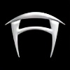
Concept work from "Forca", my Steampunk-ish storyline that I started this semester. No time to go into the details here, but this is lift hub. It's like a multifunctional bus station. *shrug* It turned out ok I guess. I thought Mel's and Serene's were so much better.
Mel's bar concept: [link]
Serene's bus station: [link]
Anyways, I hope to have more fun concepts from this story. I hate vehicles that look like vehicles, but I like critter-shaped crap, so who knows.
Forca concepts, storyline, and art © Christina Harper
Comments =
Mel's bar concept: [link]
Serene's bus station: [link]
Anyways, I hope to have more fun concepts from this story. I hate vehicles that look like vehicles, but I like critter-shaped crap, so who knows.
Forca concepts, storyline, and art © Christina Harper
Comments =
Image size
800x538px 274.17 KB
© 2009 - 2024 Cylu-chan
Comments3
Join the community to add your comment. Already a deviant? Log In
Hey Christina! Long time no talky! Figured I'd give you a critique, because your painting is solid, but with a few tweaks here and there, I think you could push it further and make it even better.
First of all, I really like the palette you went for. It's a nice combination of warm and cool elements and makes for an interesting scene. I also really dig the beetle up front, I like the colors and the design on him, especially the carrier on top. Looks like a fun ride.
Overall, the piece is working fairly well, but one thing I think you could do to bring it together some more is do a 'color balance' adjustment layer on top of everything. Do some minor slider adjusts and it should help unify the colors all a little more. I would also consider playing a bit more with atmospheric perspective, as the contrast on some of the further beasties seems a little high for their distance from the viewer.
As far as composition goes, I might try to vary the sizes of the characters just a bit more. Some of them are fairly close in size to each other, even with the varied distances, and upsizing or downsizing a little bit would make the image a little more playful and less cluttered. Another little thing is the perspective on the right building, it seems a little tilted toward us, the angle might be just a tad too extreme. Probably an easy fix with the transform tools. One other little thing is the shadow under the beetle isn't connecting to the far right leg.
Also, some little additions that I think would be easy, but could really spice it up, is adding in some of the little travelers, and maybe paths or roads connecting the different buildings. With roads, it could really help lead the viewers eye around the piece and direct them where you want to.
Like I said, overall the piece is looking pretty good, but you could push it even further with some minor tweaks. Even just a little atmospheric perspective, and a color balance adjustment layer to bring the colors together a bit would benefit it. Again, love the beetle, and the palette, makes me wanna know more about the universe the exist in. Where they come from, and what else they're used for.
Keep it up, you're definitely going a good direction with your work. Maybe I'll catch you around the school when I come back next semester. Take care!